The World Bank has recently released an "e-Atlas" that provides an interesting collection of maps and graphs for a wide range of economic development indicators. Over 170 indicators are provided for more than 200 countries.
Let's suppose that you want to graphically compare per capita GDP in PPP international dollars for Luxembourg, Norway, and the entire world, from 1980 to 2009. No problem! The data can be compared "on the fly" or exported for further analysis.
What about a comparison of the percentage of births attended by skilled health staff, in Haiti, Kenya, Somalia and Pakistan? It's just a click away. Did you know that this percentage declined from 50% in 1989 to 41.6% in 2003, in Kenya? It was still only 26.1% in Haiti in 2006.
You can also create "zoomable" maps that display the global "distribution" of the variables you're interested in. These maps have nice "hover over" features and can be animated to depict changes over time.
Here are a couple of examples to whet your appetite.
1. Maternal Mortality Rate (The Whole Wide World):


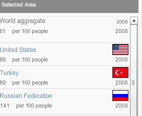
2. Mobile 'Phone Usage (Zoomed in to Selected Region):


This is a nice utility that's definitely worth checking out. And you even get to choose the colours!
© 2011, David E. Giles